8 Gallery Wall Ideas for a Small Living Room
The pictures on this page are AI-generated illustrations of each idea, not photographs of real homes. How this site is made.
Small rooms need smart walls, not bare ones. Empty corners feel wasted, but a cramped gallery can feel cluttered fast. Finding that balance is the real challenge in a tight living room.
Good news: size limits actually make choices easier. Fewer square feet means fewer frames, tighter spacing and simpler color schemes.
Renters worry about nail holes, and homeowners worry about scale, but both problems share the same fix. Smart layout choices solve both at once, no matter your wall type.
Think about shape before you think about frames. Vertical arrangements work wonders on narrow walls.
Horizontal rows calm down low, wide spaces. Corners and awkward slivers of wall have their own tricks too.
Here are eight layouts built for small living rooms, from tight clusters to leaning ledges.
1A Matching Pair Above The Sofa

Two frames, same size, same art style, hung side by side above the couch. It works because the wall is narrow and busy nearby, with a staircase and an open nook pulling the eye. A pair keeps things calm instead of adding more visual noise.
The art itself is simple too, soft shapes in muted colors that echo the rug and sofa without competing with them. For a small living room, this is often the safest gallery option. One pair reads as intentional, not sparse, and it fills the space over the sofa without crowding a tight room.
One tip: center the pair as a single unit over the sofa, not the wall, and keep a few inches of frame space between them so they read as one grouping.
2Matching Burgundy Frames In A Tight Salon Cluster

Uniform frames are the trick here. Every piece sits in the same burgundy and gold frame style, so even with nine different images, botanical prints, old portraits, a landscape sketch, a candid couple shot, the wall reads as one calm collection instead of clutter. That consistency matters more than the content inside the frames.
Small living rooms often can't afford a loose, eclectic mix because it reads busy in a tight space. Here the frames sit close, with only a little wall showing between them, which makes the whole cluster feel like a single piece of furniture rather than nine separate decisions. It also hides the plaster texture nicely without competing with it.
One tip: buy frames in one finish and size family first, then fill them with mismatched images. The shared frame style does the unifying work your wall needs.
3A Single Row Of Five Matching Line Art Prints

The trick here is restraint: five frames, one size, one style of art, lined up at the same height. That repetition does the heavy lifting, so the wall reads as calm and intentional instead of busy, even with five separate pieces on it. For a small living room, this matters because clutter on the walls makes a tight space feel smaller.
A single row like this keeps the eye moving horizontally instead of jumping around, which actually makes the room feel wider. The simple line drawings keep the mood light without demanding attention, and the matching white frames let the art, not the hardware, be the focus.
One tip: hang the row so the frame centers sit about level with your eyes when standing, then use a level and a shared pencil mark to keep every frame perfectly even.
4Stacked Picture Ledges In A Tight Corner

Leaning frames on ledges solve the small room problem better than hanging them flat. You can swap, resize, or overlap pieces without new nail holes, which matters when space is tight and walls do double duty. Two shelves stacked here hold a mix of art, photos, and a small plant, so the corner feels layered, not cluttered.
Depth comes from the leaning frames overlapping each other, not from covering more wall. This works well next to a window, since the ledges stay narrow and don't block light or sightlines. A cozy chair underneath keeps the whole corner feeling lived in rather than staged.
One tip: lean your largest frame at the back of each ledge first, then add smaller prints and a small plant in front for easy, changeable layers.
5A Rising Diagonal Line Above The Sofa

Five frames climb the wall in a straight diagonal line, each one a little larger than the last. That is the trick here: the line gives a plain, flat wall a sense of movement, and because the sizes grow as the frames rise, the whole run feels planned rather than crooked. Each frame has matching black trim and a kraft mat, which keeps five different photos feeling like one set.
A diagonal also uses the height that a low sofa leaves empty, so a small room gets more out of one stretch of wall. The warm travel photos add color without clashing with the neutral wall and gray sofa below.
One tip: before drilling, lay the frames on the floor in your diagonal line first, then measure the gaps between them so the spacing stays even all the way up.
6A Sunburst Of Round Frames Around A Central Mirror

A mirror in the middle is what makes this layout work. It reflects light back into the room, which matters a lot in a small living room that only gets one window's worth of sun. The round frames fan out evenly from that center point, so your eye reads it as one shape instead of eight separate photos.
Matching frame color and shape keeps a mix of personal snapshots, a pet, a sunset, a family photo, from looking cluttered. Below it, a low bookshelf holds a couple of smaller framed prints and a plant, which grounds the wall without competing with it. This works especially well on a narrow wall or pillar where a square arrangement would feel cramped.
One tip: hang the mirror first and level it, then work outward in a circle, spacing frames by eye rather than a ruler for a natural sunburst look.
7A Single Vertical Column In A Narrow Wall Strip

Narrow walls get skipped over, but this column proves they're some of the best gallery spots in a small room. Four same-size frames stack straight up, filling a skinny gap between the window and the corner that would otherwise sit bare. Matching black frames and wide white mats keep the eye moving in one line instead of scattering it sideways, which matters when floor space is tight.
Landscape photos in muted greens and blues echo the view out the window, so the art feels connected to the room instead of competing with it. This layout needs almost no width, just height, making it ideal for awkward slivers of wall beside doors, windows, or furniture.
One tip: measure your narrow space first, then pick a frame width that leaves at least two inches of wall showing on each side for breathing room.
8A Horizontal Row Of Five Matching Landscape Prints

Five frames in a straight line turn a narrow stretch of wall into one long, calm visual. Matching wood frames and white mats keep the eye on the photos, not the hardware, so the scenery reads as a single story, mountains to coast to desert to forest to river. This layout suits small living rooms because it uses width instead of height, sitting low enough to pair with a console table and stay out of the way of doorways or light switches.
Equal spacing between each frame matters more than exact photo content, since rhythm is what makes a row feel planned rather than random. A pink wall adds warmth without competing with the images.
One tip: cut paper templates matching each frame size, tape them up first, and adjust spacing until gaps look even before hammering a single nail.
The Furniture Clearance Math Nobody Checks
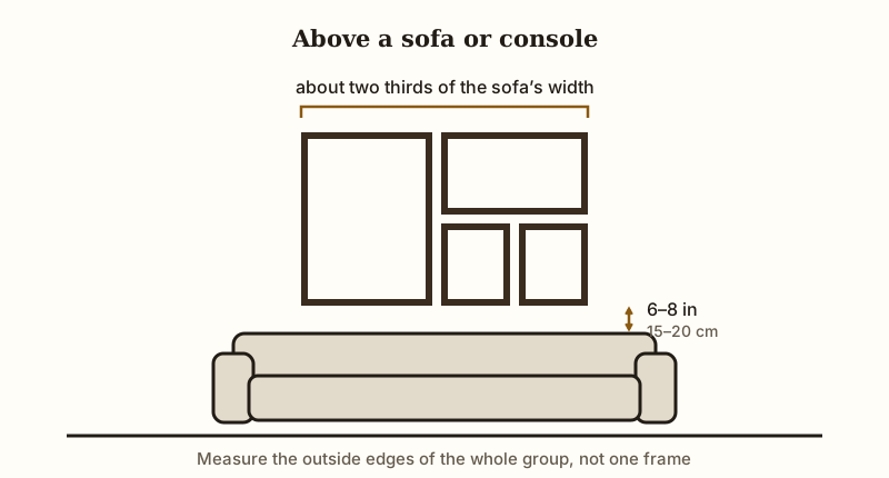
Most people hang art first and push furniture back later. Flip that order. Measure from the top of your sofa or console before you touch a drill.
Above a sofa or console, leave six to eight inches of clear space between the furniture top and the bottom edge of your lowest frame. Any tighter and the grouping looks squashed, almost stuck to the couch. Any looser and the frames float, disconnected from the furniture below.
Width matters as much as height. A grouping that spans roughly two thirds of the width of the sofa tends to look anchored. Much narrower and it reads as an afterthought.
Much wider and it overhangs the furniture. Measure the outside edges of the whole group, not a single frame.
Sunburst arrangements centered over a console need extra side clearance too. Lamps, vases and plants stick out further than you think. Check the full footprint of the console, not just its tabletop width.
Small rooms punish miscalculation fast, since there is no spare wall to shift things over. Grab a tape measure before a pencil, every time.