What to Hang Above the Bed: 8 Wall Art Ideas
The pictures on this page are AI-generated illustrations of each idea, not photographs of real homes. How this site is made.
That bare stretch above your headboard feels like a dare. Empty walls make a bedroom look unfinished, even when everything else is done. Good news: you don't need a huge budget or design degree to fix it.
Size matters most here. Art above a bed should span roughly two thirds of the headboard width.
Too small looks lost. Too large can crowd the ceiling.
Height counts too. Leave about six to eight inches between the top of the headboard and the bottom of your art. This keeps things balanced, not floating.
Style is where the fun starts. Texture, color and shape all change the mood of the room. Some options feel soft and calm.
Others add drama or warmth. Here are eight ways to fill that space well.
1Three Linen-Panel Squares In A Staggered Row

Three matching frames with plain linen panels sit above the bed, slightly staggered instead of lined up in a perfect row. That small offset is the trick here. It makes blank canvases look intentional, like a design choice, not like art that got lost before it arrived.
Each frame uses the same wood tone and size, so the grouping reads as one piece even with the height shift. This works well for renters because the panels are light and need only small picture hooks, not heavy anchors. The neutral fabric also plays nicely against a dark accent wall, softening it without fighting the warm pillows and lamp light already in the room.
One tip: stagger frames by no more than two or three inches in height so the grouping still feels connected, not like three separate accidents on the wall.
2Oversized Abstract Swirl Painting In A White Mat Frame

Scale is what makes this one work. The frame is big enough to hold its own above the headboard, so it reads as one calm focal point instead of a small square floating in empty wall space. A single large piece like this is often easier for renters too, since it means hanging one hook instead of planning a whole grid.
The muted blue, orange and sage palette sits easily with the navy pillow and plain linen without matching them exactly, which keeps the room feeling pulled together but not matchy. Abstract shapes also hide the fact that art above a bed is usually viewed at an angle, not straight on.
One tip: measure your headboard width first, then pick a frame that covers about two-thirds to three-quarters of it for a balanced, grounded look above the pillows.
3A Matched Pair Of Moody Landscape Photos

Two mountain photographs in the same moody light read almost as one wide image split in half. That trick lets a narrow wall space feel bigger without buying one oversized print. Black frames with white mats add contrast against the soft, cream colored walls and pink bedding, so the art stays the visual anchor even with warm sconce light and plants competing for attention nearby.
Choosing two photos from the same series, same light, same color tone, keeps the pairing calm instead of busy. It also gives a rental friendly option, since two medium frames are easier to find secondhand than one giant statement piece.
One tip: keep the space between the two frames narrow and align their tops exactly, so the pair reads as a single wide composition rather than two separate pictures.
4A Six-Print Botanical Leaf Grid In Matching Black Frames

Six matching frames turn one plant theme into a full wall of art, and the grid layout is what makes it work. Each leaf print sits in its own black frame, same size, same mat color, so the eye reads them as one unit instead of six separate pictures. That repetition is forgiving for renters, since even a slightly uneven hang still looks organized because the pattern carries it.
Sage green backgrounds echo the warm wood tones in the bed and nightstand, and navy accents in the bedding tie back to the rug below. For a room with natural materials and a calm palette, botanical prints add color without clashing or feeling trendy.
One tip: space the frames two to three inches apart in every direction, and keep the bottom row about six to eight inches above the headboard.
5A Leaning Gallery On A Picture Ledge

One row of screws for the ledge, then no more nails, no measuring tape and far fewer holes to patch when you move out. A floating ledge lets you lean several frames together and rearrange them anytime you find a new print or want to swap one out. Here the mix of a landscape, a botanical sketch, a couple of line drawings and a small seascape works because the frames vary in size but stay close in color, mostly wood tones and white.
That shared palette keeps the cluster from feeling busy, even with five different pieces overlapping each other. For renters, this setup solves the biggest problem with art over a bed, which is commitment. You can test an arrangement for a week before deciding it is right.
One tip: lean your tallest frame at the back and smallest at the front, slightly overlapping each piece so the ledge reads as one grouping, not five separate frames.
6Fringed Woven Textile On A Hanging Rod

Weight is the thing to notice here. A thick woven hanging with a wooden dowel and fringe has real heft, so it reads as a piece of art even though it is fabric, not a framed print. It works above a bed because it fills a wide, tall space without needing a frame or glass, and the texture softens a hard wall like exposed brick.
The diamond pattern pulls in the rust and mustard tones from the bedding, so the room feels planned instead of random. Hanging it from a rod on brackets also means no nails through the art itself, just two anchor points in the wall.
One tip: mount the rod on two simple brackets instead of nails through the fabric, so the weave stays flat and the hanging is easy to take down or swap out.
7Pairing A Round Woven Mirror With A Botanical Print

Mixing a mirror with a framed print above the bed breaks up a wall that would otherwise be flat. The round rattan shape softens all the straight lines in the room, the beams, the headboard edge, the window frame, so the eye gets a rest. Hanging the mirror and the print side by side at about the same height, instead of stacking them, gives the pairing a loose, unforced balance instead of a stiff matched set.
This works well in small or awkward rooms, like one with a sloped ceiling, because you are not trying to center two things perfectly. One mirror plus one print also costs less and hangs easier than trying to fill the space with several matching frames.
One tip: line up the centers of the mirror and the print, not their top edges, since a round shape and a rectangle never share a clean top line.
8Oversized Macrame Hanging On A Wooden Dowel

Weight and texture matter more than framed art once you go this big. A macrame piece like this one covers nearly the whole headboard wall, so it does the job of several smaller frames at once. Its rust color picks up the warm wood tones in the beam and floor, which ties the room together without matching anything exactly.
Fringe and knotwork also soften a bedroom that has a lot of hard lines, like the beam and window trim. Hanging it from a dowel means no frame and no glass, and here the cords are tied to the ceiling beam, so nothing pulls on the wall at all.
One tip: choose a dowel a little wider than the weaving and hang it level, so the macrame reads as one wide shape instead of a sagging strip.
The Headboard Clearance Rule Nobody Mentions
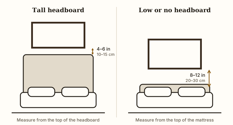
Six to twelve inches is a workable range, but most people stop at six no matter what bed they own. That gap changes depending on your headboard, and ignoring this is why so many bedroom walls feel off.
A tall upholstered headboard already fills a lot of wall space, so your art can sit closer, around four to six inches above it. Go much higher and the piece looks like it drifted away from the bed.
Platform beds and low frames need the opposite treatment. With little or no headboard, leave eight to twelve inches between the mattress top and the art.
This keeps the arrangement from reading as cramped or randomly placed. A slim metal frame or a low wood headboard both fall into this category, so measure from the bed itself, not an imaginary headboard.
Pillows complicate things, since stacked pillows can eat into your clearance fast. Measure with the bed made the way you actually sleep in it, pillows and all. Small gaps feel tight.
Wide gaps feel disconnected. Somewhere in that six to twelve inch range, almost every bed finds its balance.
One more thing matters more than any gap. Whatever hangs above a bed should be light, or fixed with hardware rated for its weight. This is the one wall where a falling frame lands on a pillow.