Picture Ledge Styling: 8 Arrangements Worth Copying
The pictures on this page are AI-generated illustrations of each idea, not photographs of real homes. How this site is made.
That one wall above your couch has probably sat bare for months. Maybe longer.
You keep meaning to deal with it, but every time you try, the frames end up crooked or crowded or weirdly spaced out. Picture ledges solve a lot of that headache, since you can shuffle frames around without a single new nail hole.
Still, an empty ledge can feel just as stuck as a bare wall. Leaning frames look simple, until you actually try to make them look right.
Getting the lean, the overlap, and the spacing to feel natural takes a bit of trial and error. Luckily, some setups just work, over and over, in all kinds of rooms.
Borrowing a layout that already looks good saves you the guesswork. Here are eight worth trying in your own space.
1Mixed Frame Sizes Overlapping On A Single Long Ledge

Height does the work here, not matching frames. The tallest piece, that leafy print, sits just left of the middle and the rest step down on either side, so your eye has a peak to land on instead of wandering. Black frames and light wood ones trade off across the row, which keeps the mix from looking like leftovers pulled from a closet.
Overlapping is the real trick though. Each frame leans slightly in front of or behind its neighbor, so gaps disappear and the whole thing reads as one shape instead of eight separate pictures.
Subjects jump around on purpose, florals, portraits, a map, a tiny figure, and that variety feels collected rather than random because the frame colors keep repeating. A small vase of dried stems at one end softens the lineup and gives your eye a place to rest before the frames start.
It turns a wall full of mismatched art into one confident shape, using height and overlap instead of matching frames to hold everything together.
2Stepped Ledges That Follow A Staircase Wall

Staircases have awkward, sloped walls, and this is a smart way to deal with that. Instead of fighting the angle, the two ledges are hung at different heights, stepping down the wall the same way the stairs do. That means the art tilts with the space instead of looking out of place against it.
Frames here are deliberately mismatched, wood, black, and gold, which keeps things feeling collected rather than bought as a set. Plants and a dried grass stem break up the straight lines of the frames and add softness against all that white wall. Overlapping a few pieces in front of others gives the shelf some depth instead of a flat row.
Anyone dealing with a stairwell or sloped hallway can borrow this exact trick. Ledges let you rearrange without new nail holes, which matters on a tight budget.
This setup solves the one problem most staircase walls have, the slope, by simply matching the shelf height to it instead of pretending the wall is straight.
3One Big Portrait Anchoring Two Small Frames

Scale does the work here. One large portrait sits at the back of the ledge, tall enough to lean against the wall without sliding, while two smaller frames overlap its bottom edge in front. That layering gives depth without needing a single nail besides the ledge itself.
Mixing a candid photo with a quiet botanical print keeps the grouping from feeling like a matched set. A brass candlestick adds height and a bit of shine, breaking up all those flat black frames. Below, the sideboard full of bowls and a small plant grounds the whole wall, so the ledge reads as part of the room instead of a display floating above it.
This arrangement proves a ledge only needs one strong, oversized photo up front to feel finished, with everything else just supporting it.
4Three Matching Frames On A Headboard Ledge

Matching frames do a lot of the work here. Each one uses the same gold edge and the same deep green mat, so the eye reads them as a set even though the art inside is different. That green mat matters more than you'd think.
It ties the warm wood tones of the headboard to the cooler abstract colors in the prints, so nothing feels random. Grouping three pieces close together, almost touching, keeps the arrangement tight instead of scattered across the ledge.
The vase and book on the left act as a counterweight, so the whole thing doesn't feel lopsided toward the art. Mounting the ledge right on the headboard also means you skip measuring wall height altogether, since the furniture sets the line for you.
Using one frame style with one mat color across different art is the easiest way to make mismatched prints look intentional and pulled together.
5Four Matching Frames Lined Up Edge To Edge

Four identical frames sit shoulder to shoulder on this ledge, and that tight spacing is the whole trick. No gaps, no stagger, just one continuous row that reads as a single piece rather than four separate photos. Matching frame size and finish makes this work.
Mismatched sizes would break the rhythm and look messy instead of intentional. Woven textile swatches fill each frame here, but the same approach works for postcards, pressed leaves, or small prints, anything with a shared color story. A ledge makes this easy because you just rest the frames and nudge them together, no measuring or nail holes required.
Below, the cabinet holds books and small objects that echo the frame contents, tying the whole corner together without trying too hard. Renters especially benefit since nothing here touches the wall permanently.
It does the most with the least: four frames, one finish and no gaps, so the row reads as a single long piece.
6Two Matching Navy Maps Anchored On A Deep Ledge

Matching frames do a lot of the work here. Both maps share the same navy frame and the same aged paper tone, so even though they sit close together, they read as one calm pair instead of clutter.
Spacing matters too. A few inches of breathing room between them keeps the eye moving left to right instead of getting stuck.
The deep ledge is what makes this setup different from a typical rail. It is wide enough to hold the vase in front without crowding the glass, and sturdy enough that nothing feels precarious. Objects placed low, like the mortar and pestle on the bench below, ground the whole corner so the frames do not float awkwardly on their own.
Repetition of warm wood, from the shelf to the live edge bench, ties the frames into the rest of the room instead of letting them feel like an afterthought stuck above a window nook.
This works because the matching frames and the deep ledge let small styling touches, like the vase and linen, do the decorating without ever competing with the art itself.
7A Low Kid-Height Ledge For Rotating Finger Paintings

Mounting the ledge low changes who the art is for. A toddler can walk up, grab the jar of crayons, and actually look at their own paintings at eye level. That's the real win here, not the wall above it.
Five frames lean in a loose row, overlapping just enough to feel easy instead of staged. Nobody measured gaps with a tape measure. The wooden giraffe and the crayon jar break up the frames so it doesn't read as a stiff gallery wall, more like a shelf that gets used daily.
Swapping artwork takes seconds, no nail holes, no patching. Baskets and toys nearby keep the whole corner feeling like a room kids live in, not a showroom. That low mounting height also protects the wall above it, since little hands reach up, not over.
This setup makes art rotation painless and puts the display at a child's own height, which matters more than any frame choice in a kid's room.
8No Ledge Needed: Three Leaning Frames On A Console

Leaning frames in graduated sizes is one of the easiest tricks for a ledge or, in this case, a console table against a wall. The big misty mountain print sits in back, the coastal shot in the middle, and the small forest path up front, so each one gets seen instead of blocked. That size step down, large to small, is what keeps it from looking like a pile of frames stacked randomly.
Matching wood tones across all three pulls the group together even though the photos themselves are different scenes. Above it, a single small botanical print breaks up the wall space and stops the eye from stopping flat at the top of the leaning stack.
The vase of dried branches softens the whole arrangement and adds height without needing another frame. Texture does a lot of quiet work here too, rough wood, woven table runner, worn clay.
It shows the ledge idea working without a ledge at all: any steady surface against a wall can hold a leaning group, as long as the sizes step down from back to front.
Why Leaning Frames Slide And How To Stop It
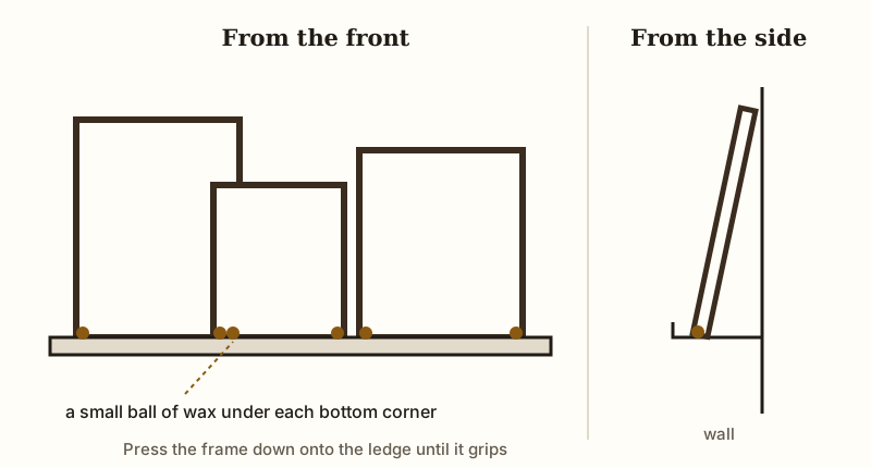
That gorgeous leaning arrangement you keep seeing online looks still in photos, but ledges shake every time a door shuts or a kid stomps down the hall. Frames creep forward a little each time, and eventually one tips off the edge. Museum wax solves this cheap and fast.
Press a small ball under each bottom corner of the frame, press it onto the ledge, and the tack holds the glass steady without damage. Removable hook-and-loop dots work too, especially on heavier frames that wax alone can't grip.
Glossy painted ledges cause the most trouble. Smooth, slick surfaces give wax nothing to bite into, so use more than you think you need. Raw wood or anything with a slight texture holds better right away.
Check your arrangement every few months, because wax dries out and loses its tack over time. Press down on each frame and feel for wobble.
Rooms near entry doors or stairs need rechecking more often, since vibration there is constant. A few minutes of maintenance beats a cracked frame on the floor.