How to Hang a Gallery Wall: Layout, Spacing and Height
A gallery wall goes wrong in predictable places: hung too high, gaps that wander, a layout that leans to one side. All three are planning problems, and all three can be solved before a single nail goes in.
This guide follows the order that works. Find the height, plan the layout on paper, choose a spacing and stick to it, then mark the wall so every hole is right the first time.

Where the 57 Inch Rule Fits, and Where It Doesn’t
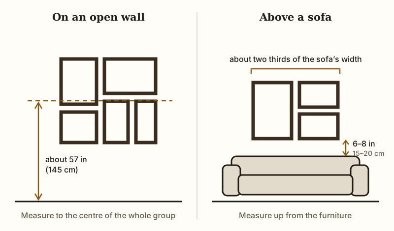
That 57 inch rule comes from museums, where one frame hangs alone on an empty wall. A gallery wall is not one frame.
It is a shape, a block of art that should feel centered on the wall as a whole, not centered around a single piece inside it. Treat the whole cluster like one big frame, then find the middle of that imaginary rectangle and hang it so that middle sits around eye level.
Stand where you actually look at the wall, not where you stand to clean it. Hallways get walked through, so eye level there is often lower than in a living room where you sit on a couch. Check the figure against your own eye height while standing normally, since 57 inches is only an average and people vary.
Furniture changes everything too. Over a sofa or console, the whole arrangement should sit lower, about six to eight inches above the furniture, so it reads as connected instead of floating. Skip the tape measure obsession and trust your eyes once the block feels balanced from across the room.
Planning the Layout on Paper or Floor Before Any Wall Touches Nails
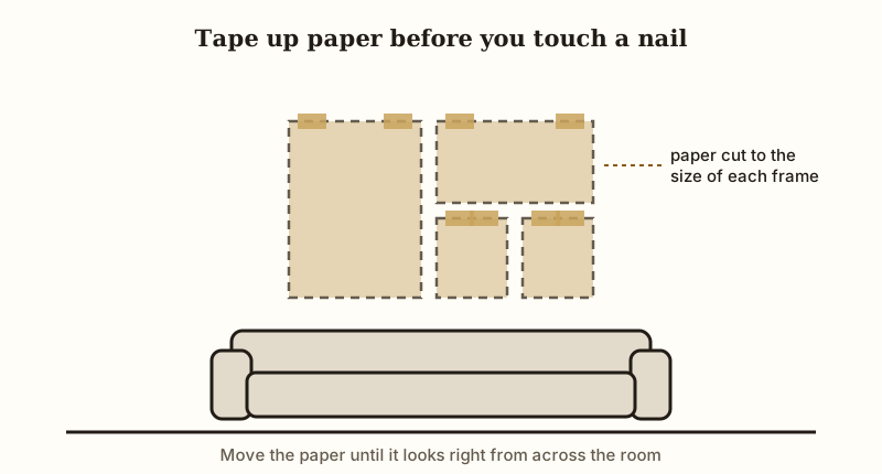
Grab a roll of kraft paper and trace every frame before you touch the wall. Lay the paper flat, place each frame face down, and run a pencil around the edge. Cut out each shape and you have a paper stand in for your whole collection.
Tape these cutouts to the wall exactly where you think they should go. This single step saves you from nail holes you will regret.
No kraft paper on hand? Your floor works just as well. Lay all your frames out on the floor in the same shape as the wall, right down to the width.
Step back, look from a distance, and move pieces until the balance feels right. Snap a photo from above so you remember the layout once you start moving things to the wall.
Paper cutouts beat floor layouts in one big way. Paper lets you see the actual wall space, including outlets, switches, or trim that might crowd your design.
You also get to test the height and spacing against real furniture below, like a sofa or console table. Tape stays up for days, so you can live with the layout before committing.
Adjust freely at this stage. Shift a square piece left, swap two frames, shrink a gap. None of this costs you anything, no new holes, no patched plaster.
Once the paper version looks balanced from across the room, you have your map. Only then should a nail touch the wall, and only where a paper cutout already told you it belongs.
Choosing a Grid, Salon, or Linear Layout Based on Your Frame Sizes
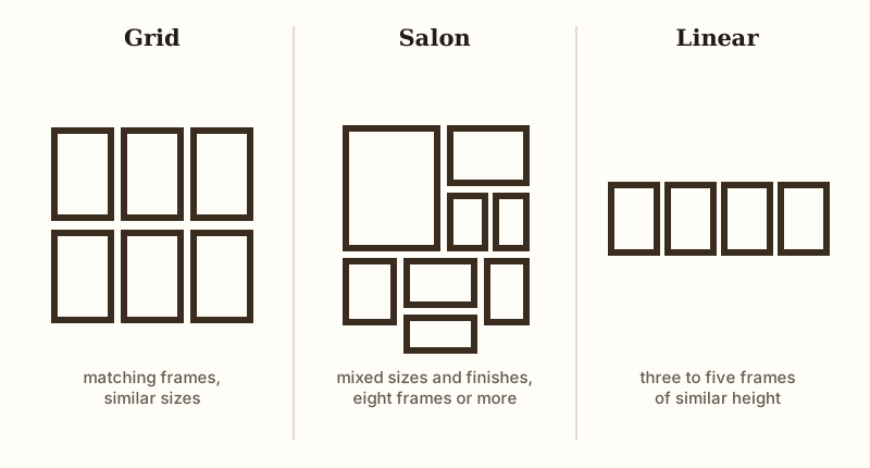
Spread your frames on the floor and look at what you actually own before picking a style. Matching frames in similar sizes want a grid. Even spacing and straight rows make a grid feel calm and tidy, which works well in small rooms or narrow hallways where chaos reads as clutter.
Odd sizes, mixed frame colors, and a stack of prints you collected over years point toward a salon layout instead. That looser, scattered style hides mismatches and actually looks better with variety, so stop trying to force five random frames into neat rows. Three to five frames in similar heights suggest a linear layout, a simple horizontal line that works above a couch, console, or bed.
Think about your frame count too. Fewer than six pieces usually look sparse in a salon style but strong in a grid or line. Eight or more frames give you enough visual weight to fill a salon wall without gaps.
Check your wall shape next. Tall, narrow walls favor vertical grids or stacked linear rows. Wide, short walls suit horizontal lines or a sprawling salon shape that stretches sideways.
Hold off on copying a layout until you know your own frame count, sizes, and colors. Trying to copy a layout built for different frames almost always ends in a lopsided, crowded mess.
Your pile of frames should decide the shape, not the other way around. Once you know your style, the real spacing math gets much easier.
How Much Space to Leave Between Frames
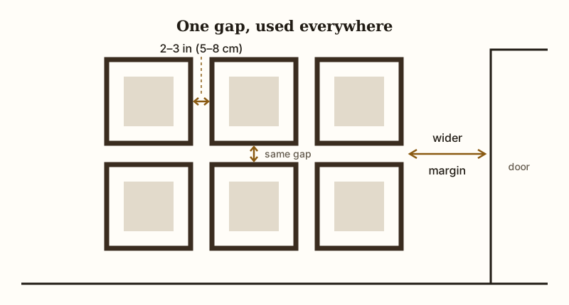
Two to three inches between frames is the usual starting point, and it suits most walls of mid-sized frames. The reason is simple.
Closer than that and the frames start to merge into one busy shape. Much wider and the wall stops reading as a group and becomes separate pictures.
Treat that number as a start, not a law. Small frames in a tight grid can sit closer, around an inch and a half to two inches, because the grid itself holds them together.
Large pieces on a big wall can take a little more air, three to four inches, so each one has room. If the frames differ a lot in size, choose the gap that suits the biggest ones and use it everywhere.
Consistency matters more than the exact figure. Your eye catches an uneven gap much faster than a gap that is slightly generous.
Pick one measurement and hold it across the whole wall, side to side and top to bottom. Cut a strip of cardboard to that width and use it as a spacer while you place each frame, instead of reading a tape measure every time.
Check the outer edge as well. The space between the group and whatever sits near it, a door frame, a corner or the ceiling, should be clearly larger than the gaps inside the group. That margin is what makes the arrangement read as one piece.
The Anchor Piece Method for Starting an Asymmetrical Wall
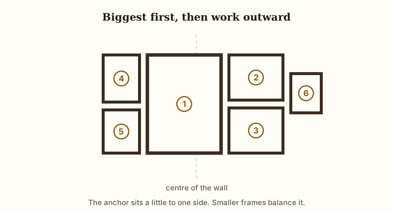
Pick your biggest or boldest frame first. That one piece becomes your anchor, and everything else gets built around it like branches off a trunk.
Most people start in a corner and drift sideways, adding frame after frame until the whole thing leans one direction and feels tipped over. Starting with the anchor stops that drift before it begins.
Place the anchor slightly off center, not dead middle, since asymmetrical walls need visual weight that pulls your eye one way before balancing back out. Set it at your eye level zone first. Then work outward in both directions, adding your next largest pieces close to the anchor and letting smaller frames drift to the edges.
Check balance every few frames, not just at the end. Step back often.
Does one side feel heavier? Shift a frame sooner rather than fixing everything later.
Smaller pieces act like filler, tucking into gaps the bigger frames leave behind. Odd shaped prints, small mirrors, or little sketches work well here, since they soften the hard edges of bigger rectangles.
Your anchor also sets the emotional tone of the wall. A bold photo or bright print pulls attention and makes the rest feel supportive rather than competing.
Trust that first choice. Everything else should react to it, not fight it.
Marking and Leveling Without Measuring Every Single Frame
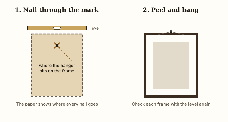
Once your paper templates are taped up and the layout looks right, do not measure each frame again. Just tape the templates straight onto the wall, using a level to square up the top edge of each one.
A bubble level or a phone level app both work fine. Stand back, check the whole block looks straight, then start marking.
Here is the trick. Poke a small hole through the paper where the hanger sits on the back of each frame. Push a nail through that exact spot into the wall, right through the paper.
The template tells you exactly where to hang, so you skip all the math about hanger distance from the frame top. No rulers. No guessing.
Peel the paper away once the nails are in. You should see a wall full of nails in the right spots, still matching your floor layout. Hang each frame on its nail and check it with the level again, since frames can tilt even on a straight nail.
Work top to bottom, left to right, so you always know which template matches which frame. Label the back of each paper template with the frame name if your layout has a lot of pieces. Confusion costs more time than careful labeling ever does.
This method turns hanging day into placing nails, not solving puzzles. You already did the thinking on the floor. Now the wall just copies what you planned, holes in the right spots the first time.
Fixing a Gallery Wall That Already Looks Off
Standing too close makes any gallery wall feel wrong. Back up ten feet and look again before you panic.
If the whole thing reads too high, it probably sits too far above the furniture, or its center is above standing eye level. Pull the lowest frames down and the block often fixes itself without touching the top rows.
Uneven gaps are the next common problem. Measure the spacing between each frame edge, not the centers, and you will usually spot one gap that is double the others. Shift that frame closer and the eye stops catching on it.
A lopsided layout, heavier on one side, needs a visual weight swap. Move a dark or large frame from the crowded side to the empty side.
Tilted frames are a hardware issue, not a hanging mistake. Two hooks per frame, spaced wide, stop that drift completely.
Sometimes the honest fix is removing one piece. A gallery wall with nine frames can look calmer than the same wall with eleven. Patch the extra holes, step back, and trust what looks balanced over what looks exact on paper.